

3 simple steps to color coordinating for your beachside family photo session
Summer vacation time is here - finally! And a vacation would not be a vacation here in sunny Tampa Bay Florida if you and your family did not take advantage of one of our beautiful beaches. TripAdvisor recently rated Clearwater Beach as the number one beach in the United States, and is one of the top 25 beaches in the world. Let me repeat that - the world. As a Florida native who doesn't appreciate the beaches here nearly as much as I should, I find this incredible, and it's motivated me to go out and utilize these locations even more.
So, whether you're a native or a tourist, a beach vacation and beach photos all in one are a practical and fun way to make the most of your summer.
By the time you're finished reading this post, I can almost guarantee that you will be significantly less stressed about any upcoming beach photo sessions you may have - relax, grab a piña colada, Mai Tai or mimosa, and read on.

Low tide with a view of Old Tampa Bay, the Bayside Bridge beyond
1. Keep Cool
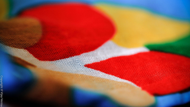
"Colours of Loom" by humdingor, licensed under CC BY-SA 2.0
Looking great doesn't mean throwing practicality to the (hot, humid, barely discernible) wind. Wear flats and light, breathable fabrics. Make comfort and good fit your utmost priority. However, remember that unless the whole family is going for a swimsuit theme or a candid shoot of everyone frolicking in the water, stow the board shorts and bikinis away in the car or wear them beneath your clothing until the session is complete.
Light, Breathable Fabrics:
- Cotton
- Chambray
- Rayon
- Linen
- Silk
- Georgette
- Jersey
- Synthetic Blends
2. Main, Neutral, Accent

Pantone's top 10 Spring/Summer colors for 2016
I recommend you (or delegate this to the most fashionable one in your family) choose 3 colors for the entire family: main, neutral and accent. I recommend 3 colors because it is still simple while not looking like you just put on your family outing uniforms. Moreover, the beach is essentially a blank canvas: you will be surrounded by the neutral white/beige of sand, and color will photograph great.
Main Color: This is the main color that will pull everything together. It can be any color you desire. For instance, if you already know you want to wear your favorite dress, note its main color and build from there. Pantone - basically the authority on all things color for creatives - has released their spring/summer color report for this year; I invite you to take a look at their site if you're in need of more ideas. I especially enjoy the color names - an aqua is limpet shell, a light brown iced coffee.
Neutral Color: This is the color that unifies the main and accent color. These are the classics and probably the easiest to find in your wardrobe: white, brown, black, beige, gray and blue.
Accent Color: This adds an extra dimension to your outfits and is used sparingly. Just make sure this color is complementary with your main color. In the individual descriptions of their top 10 colors, Pantone also offers 3 other color ideas that make good pairings.
Wear these colors however you like - add layers and accessories, or keep it simple, clean and classic. Have one person wear the accent color on their shirt, while another has it on their pants. It is all a matter of your own personal taste.
3. Patterns
Some photographers will tell you to avoid patterns altogether. This is because loud patterns may draw the eye away from your smiling faces and settle on your checkered, striped and paisley shirt. Honestly, I love patterns. It is all a manner of personal taste and a bit of common sense (I wouldn't recommend that checkered, striped and paisley shirt). I find that patterns add personality and visual interest as long as they don't clash with each other, cancel each other out and open up a black hole.

Masuka knows how to add visual interest.
That's all you need to know!
I hope this blog post has at least given you a few ideas on what to wear during your upcoming family beach session and taken some of the guess work out of color coordination. As someone who is challenged when it comes to fashion as well as a nerd and an artist, I've found that proven frameworks and some basic knowledge of the color wheel actually makes shopping for clothing, dare I say it, fun. (But my dream is still to hire my own personal stylist.)
Do you consider yourself a stylish person, or are you in the same boat as me? Have any more tips? I would love to hear them - leave a comment below! I recently learned that my ideal color palette is deep autumn. How fancy.
Also, if you found this post interesting subscribe to my mailing list - you will receive more simple guides, blog updates, wall decor freebies and early access to promotions and contests.

